We had a discussion going on in our team yesterday about Google’s latest update of their interface design – with some of us referring to google in the past as beeing techie – which I disagreed. However, discussing the pro’s and con’s of the new design made me review where Google has been coming from. Google’s latest blog post is a good starting point. In 1997, when Google was launched it looked like this:

While it may not have been the most beautiful web (and esp. logo) design, it was clear and focused and improved quickly over the following two years:

Well, that was Google in 1999 and I dare to say: compared with other search engine that have been out there at that time, it was a little design revolution. It took me a while to remember what search engine I was using before Google, but (apart from the German meta search MetaGer that I was using most often) it must have been Altavista and Lycos. The Wayback Machine helped me to recall how they looked like in 1999:


With its home page focussing on that one user task („I want to find xyz“), Google made a point and it soon became a strong brand built upon a set of design principles. In 2007 they put down the „Googley Design Principles“:
1. Focus on people—their lives, their work, their dreams.
2. Every millisecond counts.
3. Simplicity is powerful.
4. Engage beginners and attract experts.
5. Dare to innovate.
6. Design for the world.
7. Plan for today’s and tomorrow’s business.
8. Delight the eye without distracting the mind.
9. Be worthy of people’s trust.
10. Add a human touch.
Consequently, these design principles are, more or less, derived from the „ten things we know to be true“.
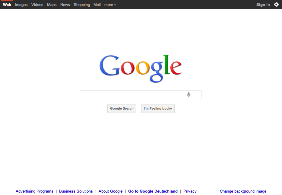
But back to the future. Is the 2011 design update still „googley“? Two things came to my mind, when I saw it yesterday:
– why have a search button, if instant search triggers an immediate page load? The search button becomes a button you will never be able to press…
– and what about the bar at the top of the page? Is that googley? Or isn’t it just like anything else is right now? (If you think of twitter, wordpress etc..) That doesn’t make it bad UX design but Google has always been strong in branding the few elements their interface is made of and it feels like giving up on that at the moment.
Just think of this ingenious piece of branded interaction:

Visually branding a functional element like the pagination (which really is at the heart of Google’s business) is excellent (brand) design.
Introducing a top nav bar (and visually related side bar), that is well designed but looks like Web2.0 in 2011 looks like is just… nice.