You‘ve probably been following the discussion about flat design in the blogs. Designers are debating about the pros and cons of flat design, about whether it is just a short trend or if it‘s going to stay and about the fact that flat design forces designers to recollect basic design skills and principles.
As Jonathan Ive says about Apples new UI design:
True Simplicity is derived from so much more than just the absence of clutter and ornamentation. It‘s about bringing order to complexity.
Flat design makes designers focus even more on clear structure and good usability.
But how come flat design evolved just now and in what way is it going to progress in the near future? Looking at the reasons for the rise of flat design helps to understand when to apply it and in what occasions a skeuomorphic design might still be helpful. It also shows quite plainly what flat design demands from visual designers especially when creating brands.
What are the reasons behind the rise of flat design?
For sure visual designers got tired of using drop shadows, bevels and glossy effects and pushed to create something new. Besides the fresh visuals there are some technological reasons that lead to the development of flat design.
1. The impact of technology on flat design
Visual designers responded with the flat design to several aspects of the current prevalence of mobile devices , such as the variety of screen sizes, responsive design and the limited mobile bandwidth.
The introduction of the flat style simplified designing for responsive structures as it allows a ,secure‘ and easy to manage visual scalability. Even if someone would layout for only one screen size, it is easy to foresee what the design might look like in other screen sizes. Another big plus is that it is much faster to code because there‘s less effects to it.

A website that uses flat design is not only quick to design and code, most significantly it loads faster on peoples mobile devices–especially with the mobile bandwidth that is often limited today. Instead of wrapping buttons and style elements in pngs, the flat style provides mainly codeable elements (at least for most browsers) which are smaller in file size and thus use up less bandwidth and computing power on mobile devices. (Side note: A fast loading website is also a favour to users outside first world countries as bandwidth is much more limited there.)
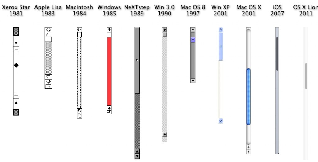
Once again limited resources have led to a trend of flat design. There already was a flat design before–it appeared even before the rise of skeuomorphic design. It emerged at the time when the first graphical user interfaces were build and computing power for personal computers was still limited. At this point in time, graphics had to be reduced to their absolute minimum to enable fast processing. From this excellent comparison of scroll bars you can see the transition from flat design to skeuomorphic design and back to flat design.

Touch interactions could be considered another technological reason for the rise of flat design. Real life metaphors only fit to a certain degree for touch interactions. This is in part due to the lack of haptic feedback. When using a mouse to press a virtual button, the haptic feedback of the mouse button correlates with the visual. When using a touch gesture to press a virtual button this haptic feedback is missing. Visual metaphors and the real life haptics start drifting apart.
The good news is: Flat design enables a new vocabulary of interactions. It is not bound to the use of inherent and real-life metaphors–like skeuomorphic design is. In other words:
Flat design describes a two dimensional design for a two dimensional screen. … With flat web design, we take a step towards accepting the unique and abstract nature of the web.
Source: Sabina Idler, Flat Web Design: Trend Or Revolution?

2. The web is our second nature
In the early days of personal computing–when this technology was accessible to novices for the first time–metaphors were needed to bridge the gap between the real world and the digital–the „tangible and the intangible“. Skeuomorphic design, with it‘s shadows and gradients, played a big role in bridging this gap as it made use of existing mental models for interacting with a completely new technology. Today, the web is natural to us and people gained a basic knowledge how to interact with it. Real-world metaphors lost their key role in helping people understand the possibilities of the web.

A similar pattern can be found within the rise of many technologies: Quite often in history existing models were borrowed for a new technology, when were no conventions or agreements on the visual appearance of that medium or technology yet. Take the very first cars, for instance: They were made to look like a horseless carriage. Later on, people accepted the car as a distinct technology and designers started to develop a unique visual language for it.

Another example is the advent of the radio as a mass medium: The first radios (and TVs) that entered peoples homes were considered as a piece of furniture and therefore were designed like one. Dieter Rams and Hans Gugelot made an example by designing the Schneewittchensarg (Braun SK4), using a completely new and unique design language.

Today skeuomorphic design can still be helpful whenever we build something digital that has it‘s real-world counterpart. There already is a mental model on how to use it. An example would be the instruments in Garage Band or different audio software such as propellerhead. Skeuomorphic design can also be quite helpful when we design for digital novices like the elderly.


Skeuomorphic elements may also be helpful when designing for brands. On one hand, colour, typography and large pictures sometimes don‘t suffice as main differentiators to create a unique and uncopyable identity for your brand. That‘s why sometimes gradients and shadows cannot be banned completely (besides of usability reasons, see tui.de). A skeuomorphic element can also work well as a unique brand element (in an otherwise completely flat design), as you can see from the example of byrkmöbel.de.

What‘s next?
Involving flat design there is a strong trend towards a web design that is honest and adequate for the web as a medium. The variety of design styles on the web will continue to progress in that ever changing digital landscape. Possibly we will also be tired of a flat design at some point. Then there might be a turn towards design elements like structures, graining and gradients which might originate from the digital medium itself and can only be created in a digital way.
In any case, from the course of the different visual languages of the web, we can tell that digital design will grow up to a more and more distinct and individual design language instead of imitating real life.
Image sources
Scroll bars
iBooks
Calendar / notes
Reason6
Compass
Interval Timer App
Live Race App
Red bull studios
skype
first car
VW Beetle
first radio
Braun SK4
byrk