Das Thema Responsive Design wurde auf Brandnewthinking.de bereits aus unterschiedlichen Perspektiven besprochen. Vom Mobile First Ansatz über die Diskussion native vs. web, bzw. Apps oder Web Apps bis hin zu technischen Aspekten oder aus UX-Sicht.
Für viele Webdesigner ist das Thema ein alter Hut, aber die Überraschung bei Menschen, die nicht so tief im Thema sind, wenn sie eine wirklich gut funktionierende responsive Seite sehen, ist immer noch groß und so scheint das Thema aktuell genug, um einmal die wichtigsten Online Artikel zusammenzustellen.
BASICS
Responsive Webdesign mit HTML5 und CSS3 – Grundlagen
Allein die Vielzahl zu bedienender Bildschirmauflösungen, die bei weitem nicht mehr nur ein Minimallayout sinnvoll erscheinen lassen, will künftig mit bedienbaren Designs bestückt werden. Auch die Ansprüche an Funktionalität der Websites auf mobilen Geräten steigen. Das korrespondiert mit den Möglichkeiten der Geräte.
Guidelines for Responsive Web Design by Smashing Magazine
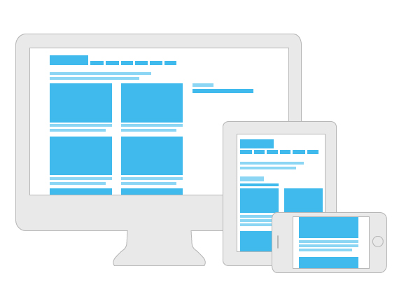
Almost every new client these days wants a mobile version of their website. It’s practically essential after all: one design for the BlackBerry, another for the iPhone, the iPad, netbook, Kindle — and all screen resolutions must be compatible, too. In the next five years, we’ll likely need to design for a number of additional inventions. When will the madness stop? It won’t, of course.
Responsive Web design is the approach that suggests that design and development should respond to the user’s behavior and environment based on screen size, platform and orientation. The practice consists of a mix of flexible grids and layouts, images and an intelligent use of CSS media queries. As the user switches from their laptop to iPad, the website should automatically switch to accommodate for resolution, image size and scripting abilities. In other words, the website should have the technology to automatically respond to the user’s preferences. This would eliminate the need for a different design and development phase for each new gadget on the market.
Responsive Web Design by Ethan Marcotte
„Fluid grids, flexible images, and media queries are the three technical ingredients for responsive web design, but it also requires a different way of thinking. Rather than quarantining our content into disparate, device-specific experiences, we can use media queries to progressively enhance our work within different viewing contexts. That’s not to say there isn’t a business case for separate sites geared toward specific devices; for example, if the user goals for your mobile site are more limited in scope than its desktop equivalent, then serving different content to each might be the best approach.“
Responsive Typography: The Basics by Oliver Reichenstein
„When we built websites we usually started by defining the body text. The body text definition dictates how wide your main column is, the rest used to follow almost by itself. Used to. Until recently, screen resolution was more or less homogenous. Today we deal with a variation of screen sizes and resolutions. This makes things much more complicated.“
Designing for a Responsive Web with Heuristic Methods by Design Reviver
„Sites that look different for different users depending upon their screen size are not a new thing, mobilesites have been around for years, but responsive design proposes something else entirely, designs which scale to anything from a iPhone right up to a 52″ high definition television screen.“
2 Indispensable Elements of Excellent Mobile Responsive Design by studiopress
It’s the idea that you are not building a web “page” anymore but rather a “network of content” that can be arranged and displayed to show it off in the best way possible, no matter where it is being viewed.
Responsive Logo Design by Anthony Calzadilla
As the content area and device capabilities increase, designers are justified in adding additional details to the logo graphic itself.
The top responsive web design problems … and how to avoid them! by net magazine
One of the things many designers are struggling with is how to explain to clients that there isn’t really a ‚visuals stage‘ any more. Responsive design is a much more fluid process and wireframing, sketching and prototyping are typically more powerful tools.
A better way to explain responsive design is to actually show a client what it can do. Don’t just talk about breakpoints and media queries and multi-device functionality – it’s easy to forget how meaningless these terms can be, even if some of them sound very obvious.
Patterns, resources and news for creating responsive web experiences.
Improving Your Responsive Workflow with Style Guides by Luke Brooker
Think of it as a universal system with a consistent experience design.
NATIVE VS. WEB
Separate Mobile Website Vs. Responsive Website By Brad Frost
The US presidential race is heading into full swing, which means we’ll soon see the candidates intensely debate the country’s hot-button issues. While the candidates are busy battling it out, the Web design world is entrenched in its own debate about how to address the mobile Web: creating separate mobile websites versus creating responsive websites.
Which One: Responsive Design, Device Experiences, or RESS?
As more organizations realize they need to invest heavily in multi-device Web designs, the inevitable question of “how” comes up. Responsive Web design, separate sites, or something in between?
BEST PRACTICE BEISPIELE
A collection of inspirational websites using media queries and responsive web design. Curated by Eivind Uggedal.
BBC TV Channel Homepages: Responsive Design by Ste Everington
Navigation varies across devices more than anything else. For example, the use of a back button across Android and iOS devices – Android includes a global back button as part of its hardware, whereas iOS only ever has software back buttons.
Adhering to all the different UI patterns across devices, from the hierarchy to the position of the navigation, would make it very difficult to achieve a consistent BBC experience across all devices – not to mention any new devices that may come out in the future.
25 Beautiful Responsive Web Design Examples for Inspiration
Responsive web design is the practice of enhancing the experience of the user by adapting the web page layout to the device he or she is using when accessing the site. There are several ways to create a responsive web design, media queries being the standard technique.
UX AND RESPONSIVE DESIGN
Design, User Experience: Wireframing for responsive Design by Leigh Howells
We now have to design and think responsively. Our layouts and our pages need to gracefully fit the device they are being viewed on. Whilst they don’t necessarily have to be perfect in all browsers across all devices, they do have to look good and present a better user experience when compared to pinching and zooming a mobile browser rendering our pages at desktop size. With statistics on mobile browsing indicating that more people will soon be accessing the web from mobile than from desktop, we have to think carefully right from the beginning of any new site we design.
Through fluid grids and media query adjustments, responsive design enables Web page layouts to adapt to a variety of screen sizes. As more designers embrace this technique, we’re not only seeing a lot of innovation but the emergence of clear patterns as well. I cataloged what seem to be the most popular of these patterns for adaptable multi-device layouts.
Responsive Design Template for Axure
An easy to use tool that helps design a responsive project with a few breakpoints in mind while allowing you to constantly examine the design on different devices.
FLEXIBLE / FLUID GRIDS AND LAYOUTS
Designing With Grid-Based Approach by Smashing Magazine
„The main idea behind grid-based designs is a solid visual and structural balance of web-sites you can create with them. […] In fact, users can easier follow the consistency of the page, while developers can update the layout in a well thought-out, consistent way.“
Five steps to gettin’ flexy in responsive web design by net magazine
The idea of ‚common breakpoints‘ is a lie and chasing after them is, as we like to say in Texas, “spittin’ into the wind.
A folding grid for responsive design.